Improving your mobile phone photos
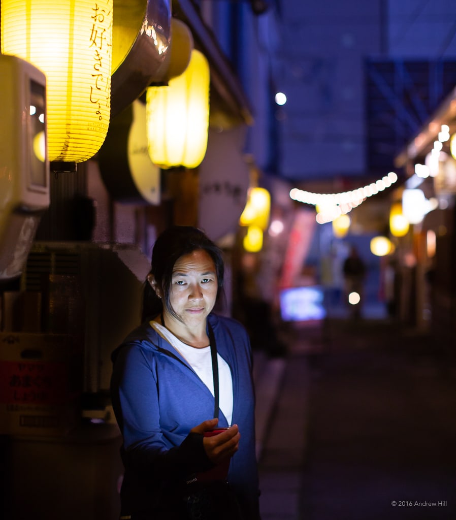
There’s a fine line between A) a subject turning their back on you and B) their posing stiffly, straight-on with a plastic smile. It’s up to you as the photographer to find the space between (A.5?). Rather than sneaking up on your subject and hoping they don’t turn around or don’t notice you, talk to them! Rather than ask them to pose, get ready for the shot, smile, look at me; ask for permission, hold your camera up and ready, but then talk to them. If you take a series of shots while they are interacting with you and/or other people in- or out-of-frame, you may get a much more interesting, natural-looking pose. Try a few of those, then let them pose and take that last, posed shot for good measure. Alternatively, you can take the posed shot first, but then keep shooting after they think you’re finished. You might find your favorite shot out of the 4 or 5 you get, is an unposed one.
Have you ever tried taking night photos with your camera, and found that they’re all pixelated, dotted with video noise? That’s because your phone camera typically adjusts for light by changing the ISO, or sensor settings. It does not adjust shutter speed or aperture (unless you have ‘portrait mode’, but more on that later), so to compensate for light changes, it increases or decreases the sensitivity of the sensor. Increased sensitivity, in lower light = more grain, or noise. So look for brighter settings for your subjects, to increase clarity and decrease sensor noise. Your phone will thank you.
Don’t move! One of the quickest ways to kill a cell phone photo is to move on, or put your phone down, before it’s taken. The movement of your hand makes the subject unclear, and often loses your original composition.
Many phones have a slight delay between pressing the ‘capture’ button and when the photo is taken.
So be safe, and hold still until your phone indicates it saved the photo.

One great thing about digital photography is that (unlike film) it’s free and easy to take lots of shots. If possible, take a few of the same shot each time. You can use burst mode on some phones, or simply hold still and hit the ‘capture’ button two or three times, with a second or so between each one. This way, your chances are much better of getting the shot without the distracting car driving by behind your subject, or without one of your subject’s eyes closed, etc. Also, if two of the same shot each have a part that you want, having multiples from the same vantage can let you cut and paste from one to the other later, in post-processing.
Most people shoot their photos from eye level. You don’t have to!
Try reaching your arm up as high as you can, and tilting it down toward your subject (take a few shots while slightly adjusting the angle).
Find a ladder, or some steps. Or try lying down on the ground and looking up.
Your subjects can look at the camera or not; the image will still feel different than your typical shot.
If you have any intention of using your photo as part of a larger story, always take shots from a few different places. The light will change, your relationship to the subject will change, and time will have passed. Photos of the same subject can look remarkably different when you walk around. When I’m shooting for an assignment, this step is critical, since I often don’t know exactly how the photo will be used. I make a point of getting my subjects up close (as close as possible), then a bit further away, with some context. Then I often take a photo as I’m leaving a venue, for the widest possible shot with the subject very small. Who knows which one will be the perfect banner shot for a story, or the best crop for an Instagram photo?
EDITORIAL
Maybe you’ve just gotten the perfect shot. You’re about to put your phone away.
But… wait!
Did you get the same shot with a different aspect ratio? (Meaning, if you shot it horizontal, did you also get it vertical? Or vice-versa?) One of the most common reasons for rejecting a photo for publication is that it doesn’t fit where it needs to. If you want your editors to love you, provide them with options, and make sure to take horizontals and verticals of your key shots.


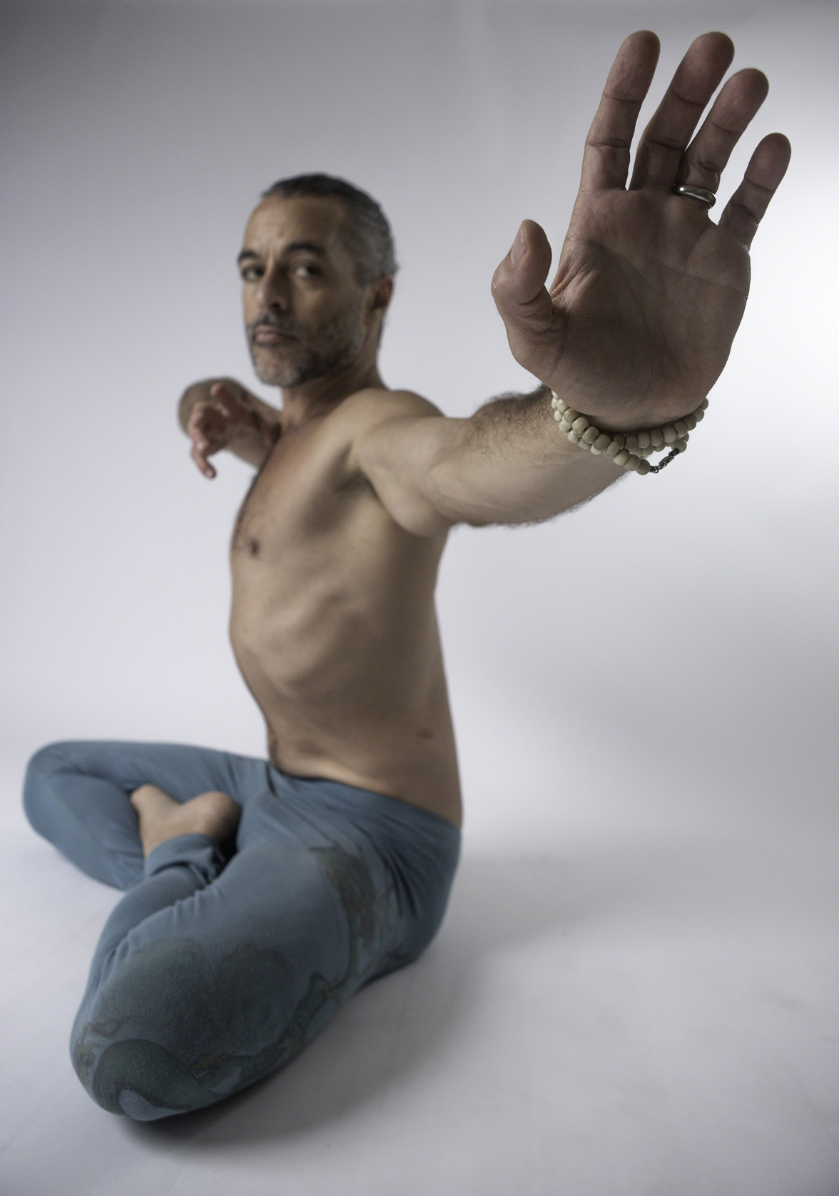
Want your photos to get used in editorial context? Provide a few, and let the editors do the cropping. Sure, you can provide one with your most favorite, artistic, beautiful composition. But then, make sure you get one with a LOT OF SPACE around the subject: area that the editor can then crop out to reshape the final image (without compromising the subject), or area that an editor can float text over for a sidebar or a title.
Sometimes the best cover shots look a little odd once you remove the title text and note all of the empty space around the subject. Start providing your editors with shots like that, and they’re more likely to get used.

Comments (0)